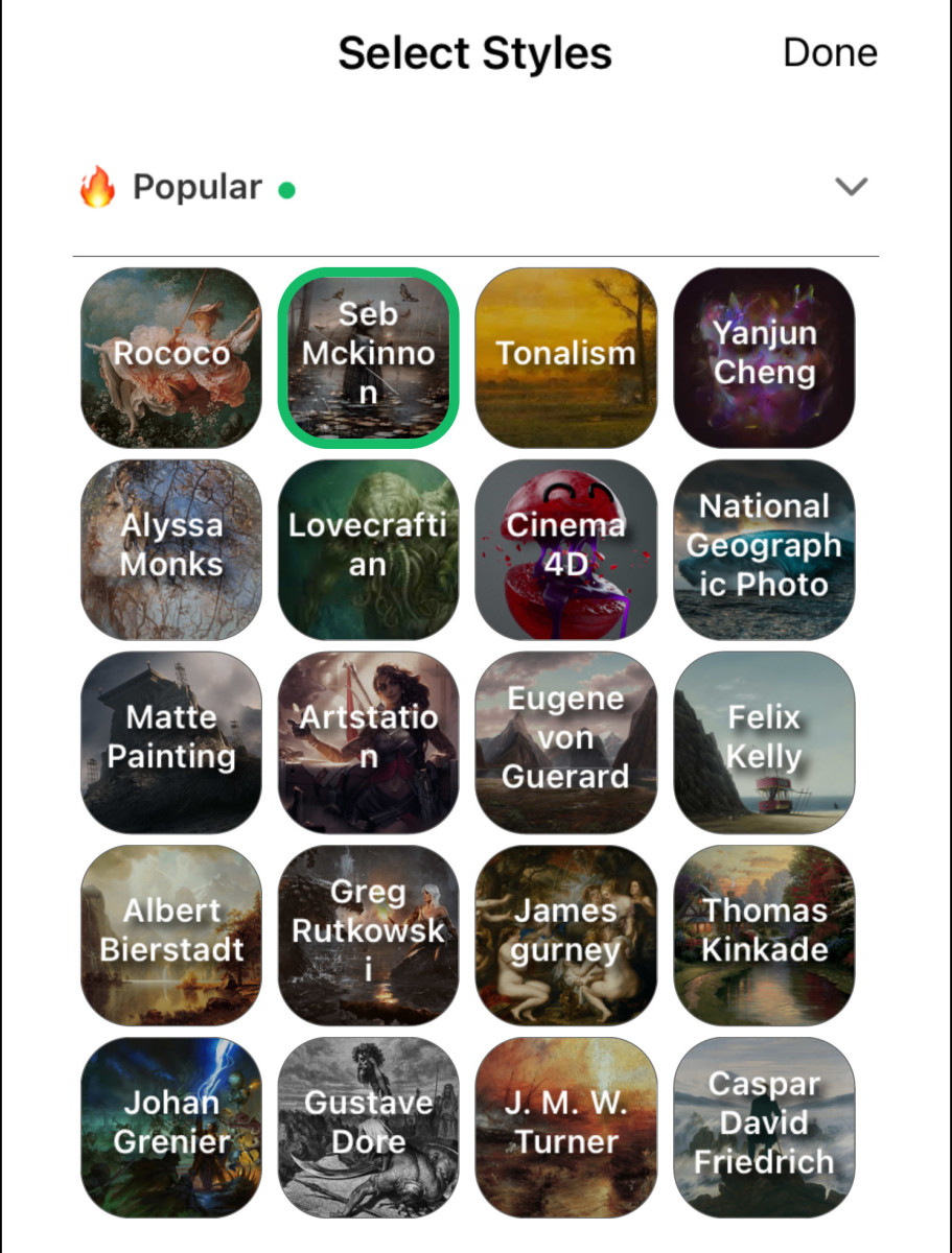
Original art painted by the author using StarryAI I’m not talking about applying a filter to a photograph, like you might do in Photoshop, Instagram or a third party app like Prisma. I’m talking about an artificial intelligence that creates art from scratch – you just tell it what you want and it does it for you. A lot of people still don’t know about it as of this writing. As more people learn about it, I believe it will cause a revolution in art, social media and society. However, if you’re reading this, it’s probably because you’re already familiar with AI art generation and you want to learn more about it. Specifically, you want to understand the various art styles, or “artists,” that are available in apps such as StarryAI. These art styles go by names of real artists of past and present such as Thomas Kinkade, Johan Grenier and Gustave Doré. Choosing these artists when having the AI create your work gives the resulting piece a unique “look,” influenced by the style of that particular artist. You can even combine artists, so you can have Thomas Kinkade, who created bright, quaint and airy pieces especially popular around Christmastime, collaborate with Gustave Doré, the artist most famous for illustrating Dante’s Inferno, about a man’s dark journey into Hades! To get the most out of AI artwork creation, however, it definitely helps to know something about each artist’s style. That’s what this essay is all about. To sort this out, I had StarryAI illustrate a simple concept, an orange, and applied a different famous artist’s style to each image. This made it easier to ascertain the influence each artist has on the artwork-creation process. This essay is the result of that experiment. In it, I will describe each real life artist’s style, and include an image that shows how that style affects the final output by artificial intelligence. AI art generation is a constantly evolving field that is continually being updated and rejiggered, so use this as a general guide, not an absolute, set-in-stone declaration on what you will get with each style. Above you see the Select Style screen of StarryAI. Each button contains the name of an artist with a background image representative of that artist’s style. You can select up to 10 artists at a time. StarryAI Mobile App - Screenshot by author While this essay is focused on StarryAI, other AI generation engines offer some of the same artists, so these tips should apply to them as well. All images were created using the Orion engine of StarryAI, which creates somewhat less abstract images than the Altair engine. The images will be presented in alphabetical order by the name of the artist. I hope you find it useful in your own AI art creation efforts.
Albert Bierstadt
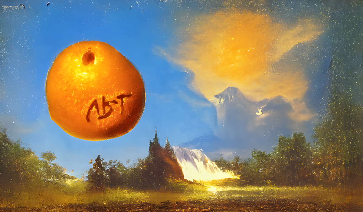
Albert Bierstadt (1830-1902) was born in Germany and was brought to America by his parents as an infant. As a young surveyor, he traveled to the great American West and was wowed by its scenic grandeur. Using the then-new technology of the camera and working from his memory, his photographs and sketches he took at the scene, he created his epic landscapes. His work was marked by dramatic lighting and atmosphere and captured soaring mountains, rolling clouds, sun-dappled hills and misty waterfalls. Original art painted by the author using StarryAI The above sample captures some of that. Notice how some areas of the ground appear to be in light, others in shadow. There are a hint of mountains in the background and a waterfall, as well as a sunrise or sunset. Into this scenic grandeur, the AI placed a large orange! (Even when being asked to paint something as simple as an orange, the AI likes to throw in a bit of extra creativity). Notice how it even seemed to etch Albert Bierstadt‘s initials in the orange! This style is a good choice when creating landscapes.
Alyssa Monks
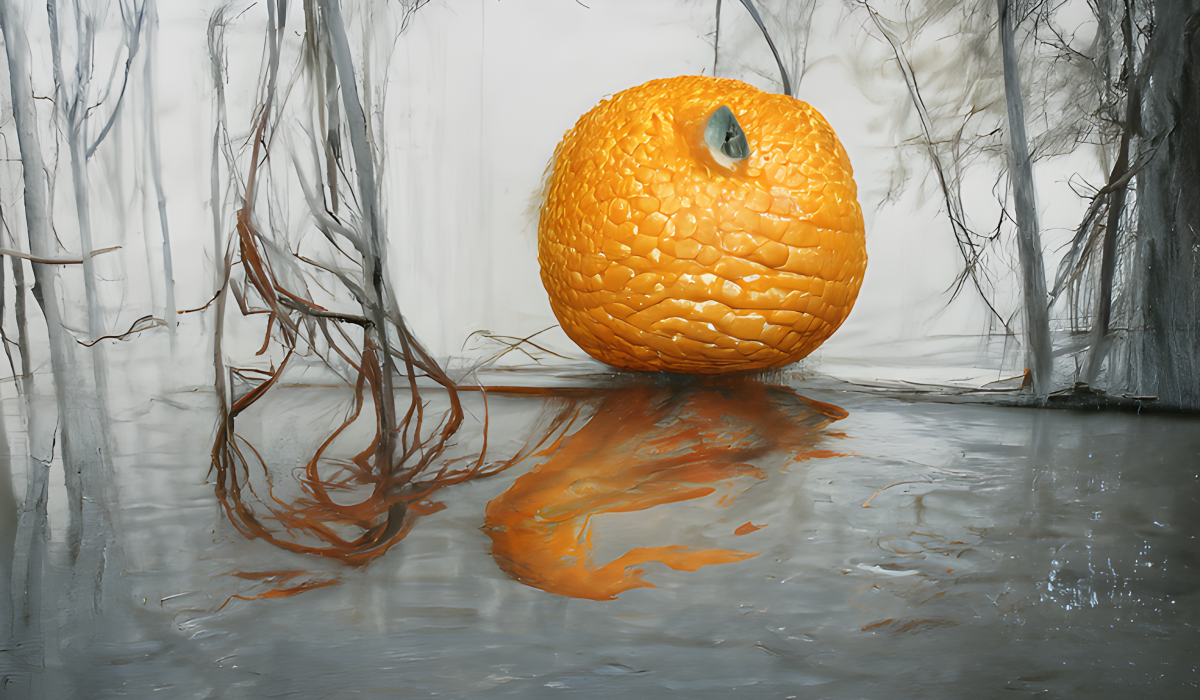
Alyssa Monks (1977- ) is a contemporary American painter living in Brooklyn. She specializes in large oil paintings of women’s faces. Usually, the faces are partially obscured in some way, such as by steam on a piece of glass in front of the subject, tree branches or even the subject’s own hair. Original art painted by the author using StarryAI Despite the proclivities of the artist this model is based on, I find this is not a particularly great model if you wish to do the face of a woman. In the above sample, you can see hints of a woman’s hair in addition to the orange, but that’s about all. The works of Alyssa Monks often contain water, and you can see this in the sample, with the pool of water on which the orange is resting reflecting the orange itself. The orange has an interesting, almost snakeskin-like texture in this painting.
ArtStation
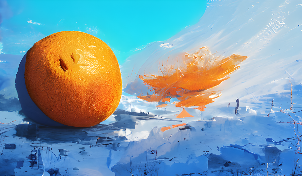
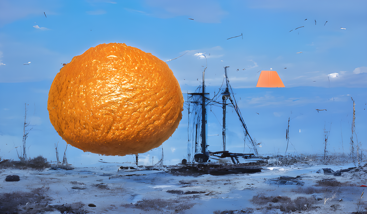
ArtStation is an online showcase for professional artists and those who want to be. It is similar to the art site DeviantArt, but is newer and can, in some ways, be thought of as its successor. Original art painted by the author using StarryAI If I were to describe the stuff on ArtStation with one word, it would be “slick.” Much or most of the work exhibits a high degree of technical skill, and the artists specialize almost exclusively in “popular” or “pop culture” subjects – fantasy, sci-fi, comic book and video game-inspired art. Browsing through the work on ArtStation, you will see it dominated by subjects such as fantasy villages, castles, dragons, monsters, sexy female warriors, superheroes and super heroines and the like. If it is marked by one thing in particular I would say it is young, sexy female fantasy-style characters. Almost all the work on ArtStation is created digitally rather than with traditional tools like oil paint and canvas. If you want to endow your art with an aura of fantasy and slickness, I would say use ArtStation as at least one of your artistic styles. The image above—an orange on a snowy landscape—is not a particularly good representation of the look ArtStation endows, although the apparently giant orange does convey a sense of fantasy.
Using Multiple Styles
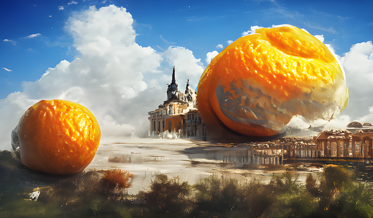
In case you were wondering what happens if you choose multiple artists or styles in creating your work, the above is an example. In it, I chose ArtStation, Matte Painting and Rococo, and I think it gives a better sense of the look the ArtStation style in particular gives a painting. Original art painted by the author using StarryAI In the above example, I believe the Matte Painting style inspired the epic landscape, Rococo inspired the architecture and ArtStation inspired the fantastical proportions of the orange. (In this case, the AI was not satisfied with creating just one gargantuan orange, but two.) in case you were wondering, the order of the artists/styles selected has a definite effect on the final artwork, and artists who appear first in the list have a greater impact than those who appear last.
Caspar David Friedrich
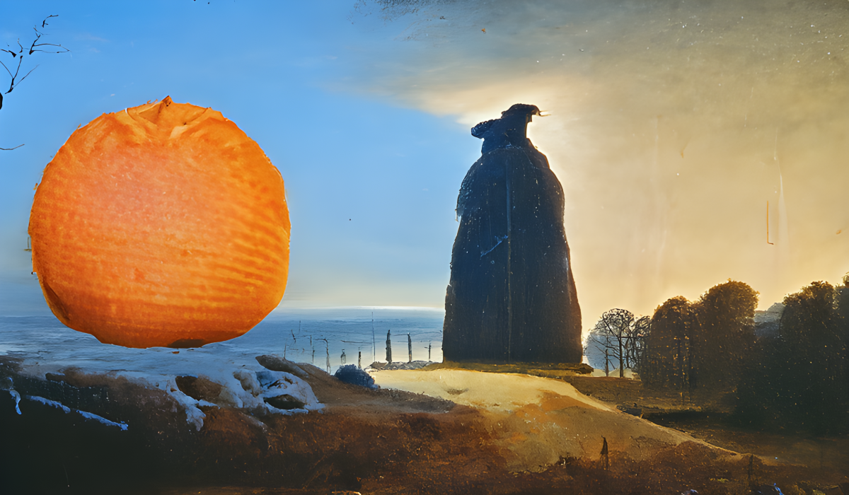
Caspar David Friedrich (1774-1840) was one of the great painters of the German Romantic movement. Although his paintings often included human figures, they focused almost entirely on the great landscapes. Friedrich used his paintings to symbolize Christ and the workings of God in such things as mountains and rays of sunlight filtering through the forest. He is perhaps best known for his “Wanderer Above the Sea of Fog” in which a lone traveler, almost in silhouette, his back toward the viewer, is perched on a rock looking out over the foggy valley in front of him. Original art painted by the author using StarryAI The AI-generated work above is somewhat similar in composition to “Wanderer Above the Sea of Fog” but instead of a lone traveler looking out over a foggy valley, we see what looks like a giant, stone statue or obelisk facing toward a large lake or ocean. The orange is there to the left of the figure. I can definitely see the influence of Caspar David Friedrich in this work. This style is a good style for landscapes with an emotional tone.
Cinema 4D
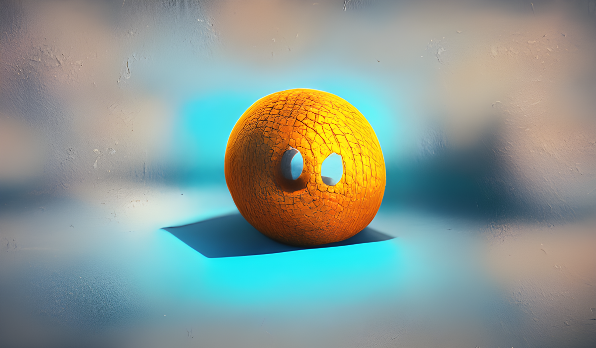
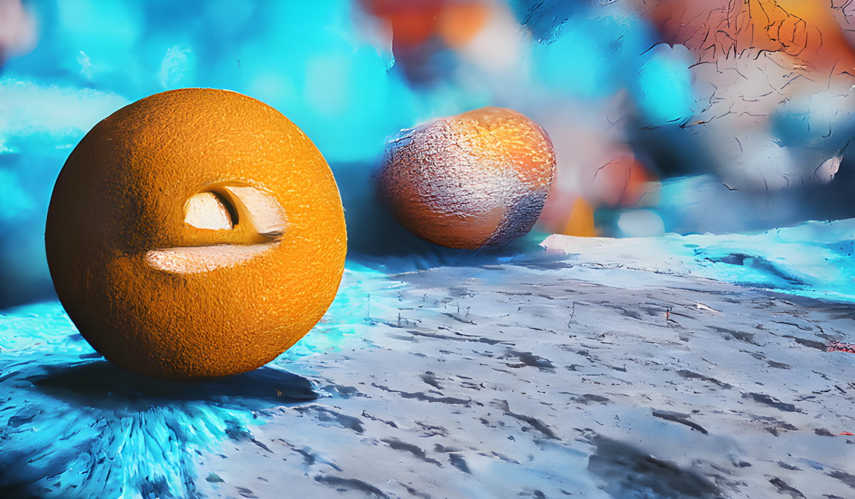
To change things up a bit, Cinema 4D is not a human artist or an artists’ community, but a piece of software, specifically, the 3D software suite developed by the German company Maxon. Cinema 4D is capable of handling everything from three-dimensional animated characters in the style of Pixar to photorealistic scenes and even human beings. Original art painted by the author using StarryAI Unlike AI art-generation software, Cinema 4D requires tons of talent and years of training to truly master (and many long-time users probably never feel they reach the point of true mastery over the software). The Cinema 4D style adds a feeling of three-dimensionality to an AI-created image. As with the other art styles, the AI learned to create images with the look of Cinema 4D by being exposed to many examples – perhaps thousands – of pieces of art created with the software. In the above example, the AI created an interesting image of an orange-like sphere in front of an out-of-focus background. It certainly has the look of three-dimensionality. It even seems to have created eye holes in the orange, as if it was going to turn it into a Pixar-style character but didn’t quite finish the job! The Cinema 4D style is a good choice if you want to endow your art with the look of three-dimensionality.
Another Cinema 4D Example
Just to show you that the AI never paints exactly the same thing twice, I wanted you to see what happens if you generate another artwork using the same style. This was also generated using exclusively Cinema 4D, but look how different it is! Instead of the out-of-focus background, the orange in this example is resting on what looks like a crusty, crackly, dry patch of earth. However, the background in this one is also out of focus. The AI decided to put two orange-like shapes in this one. Notice how the foreground orange seems to have some kind of logo or marking carved in it for a bit of added interest. Original art painted by the author using StarryAI
Eugene von Guerard
Eugene von Guerard (1811-1901) was another painter known for his great landscapes, influenced by the Düsseldorf school of painting. He focused less on atmosphere and emotion than Casper David Friedrich and more on detail. In his paintings you can see reflections in the water, fallen branches on the shore, the individual leaves on the trees. In some ways, his paintings are reminiscent of what you might find in a natural history exhibit. His goal was to document the exact details of a scene. The above image, while it does show a background landscape in which the orange is set, does not quite capture the look of the work Eugene von Guerard, in my opinion. The example of Matte Painting, below, looks to me more like the style of von Guerard’s work. Original art painted by the author using StarryAI
Felix Kelly
New Zealand-born Felix Runcie Kelly (1914-1994), in addition to being a painter, was an illustrator and graphic, stage and interior designer. He painted a variety of subjects during the course of his career, but most of his paintings had some elements of a landscape in them. His paintings included such things as a paddlewheel boat on a river, a chateau on a hill, a lighthouse, a crystal palace, a country house, etc. Even though his paintings often depicted public scenes and buildings, they had a certain surreal loneliness to them. Original art painted by the author using StarryAI Felix Kelly could be a good choice if you want to create paintings of buildings and architecture. In the above image, the AI depicted a boat on the water as the background for the orange. One thing that strikes me is how similar in composition this image is to the one directly above, perhaps because both images were generated one after the other.
Greg Rutkowski
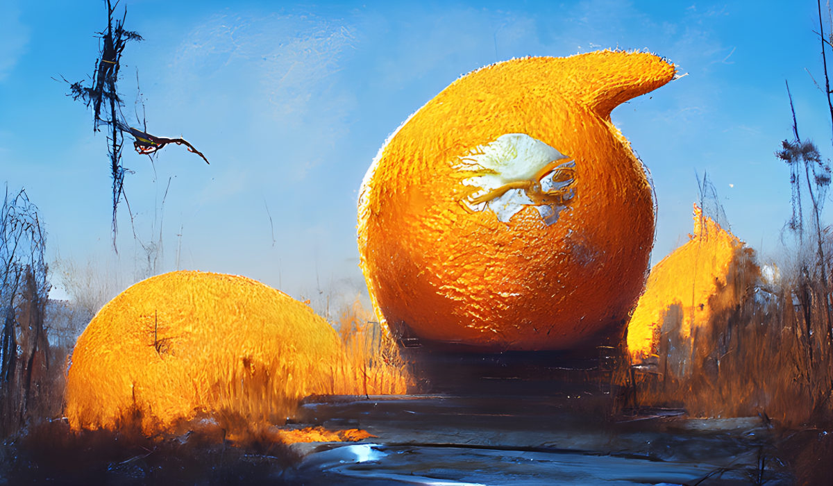
A native of Pieńsk, Poland, contemporary artist Greg Rutkowski (1988- ) is a freelance illustrator and concept artist who has done work for Wizards of the Coast, Ubisoft, Disney, Games Workshop and Blizzard Entertainment. He is popular on ArtStation (discussed above) and has recently passed the 100,000 followers mark there. He is known for his fantasy paintings involving wizards, warlocks, dragons, ogres, knights in shining armor, castles, sorcerers and sorceresses and the like. His style is a good choice if you want to imbue your image with an aura of fantasy. Original art painted by the author using StarryAI In the above AI-generated image, based on the perspective, we appear to be looking at an orange as big as a house! For a bit of added interest, it seems to have a spout on it, as well as some kind of logo or icon emblazoned on the front. It is surrounded by other large objects which appear to share some of its orangey characteristics. This image makes dramatic use of lighting and shadows.
Gustave Doré
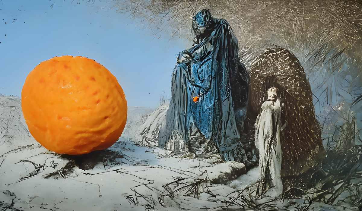
Gustave Doré (1833-1883) was a French book illustrator who created illustrations for many literary classics including Miguel de Cervantes’ Don Quixote, John Milton’s Paradise Lost, and the Bible, but the work he was most famous for was Dante’s Inferno. His highly imaginative, theatrical engravings were created using a process similar to that used for the portraits on American currency. He excelled in conveying dramatic action in mysterious, gloomy settings. Original art painted by the author using StarryAI In the above sample, we see all the elements of the Gustave Doré style. His illustrations often showed cloaked or robe-wearing figures. Here we see a large blue figure wearing a robe and studying the large orange intently. He is accompanied by what looks like a smaller white marble statue. Incongruously enough, the large blue figure seems to have an orange embedded in his robe! The Gustave Doré style is a very powerful style that will often overwhelm that of other artists who accompany it. It lends an unmistakable look to most paintings. It is a good choice for gloomy, mysterious and ancient looking images.
James Gurney
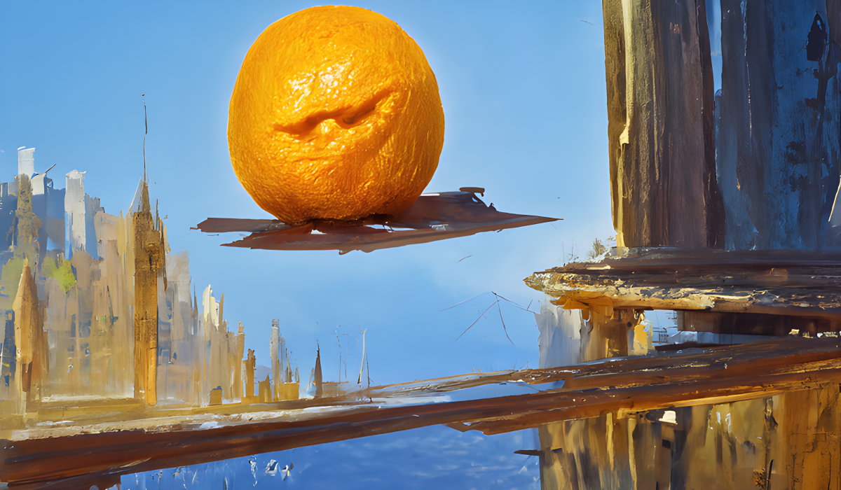
James Gurney (1954- ) is a contemporary author and artist best known for his illustrated book series Dinotopia. He specializes in painting realistic images of scenes that can’t be photographed, from dinosaurs to ancient civilizations. His tools of choice are gouache, watercolor, casein, and oils. He excels in painting the most fantastic images and subjects with an incredible degree of detail and realism. In addition to the fantastical subject matter, his works often include elements of buildings and architecture. In the above AI-generated work, you see the elements of the James Gurney style in the levitating orange (or is it riding a flying carpet) over a futuristic elevated walkway with a cityscape in the background. This is a good style to choose when you want to create images that include architecture, especially of a fantastical nature.
JMW Turner
Joseph Mallard William Turner (1775-1851) was an English landscape painter. Educated at the Royal Academy of Arts, he traveled widely throughout his career and saw much of Europe. He did landscapes in watercolor and oil in his early years, but in his later years, his work is divided into three periods: in the first, he painted many picturesque mythological and historical scenes with subdued color. In the second, he used more brilliant color and diffusion of light. In the third, his works were more in the impressionist style, achieving a sense of force by depicting objects as indistinct masses with a glowing haze of color. Original art painted by the author using StarryAI During his lifetime, he achieved the remarkable distinction of doing more work than any other artist who had ever lived—2,000 finished paintings and more than 19,000 sketches, watercolors and drawings. His marvelous memory allowed him to later paint almost every type of landscape he had seen. These are two traits that artificial intelligence shares with him: prodigious output and a photographic memory. Use his style when you want to give your work a more impressionistic, painterly feel.
Johan Grenier
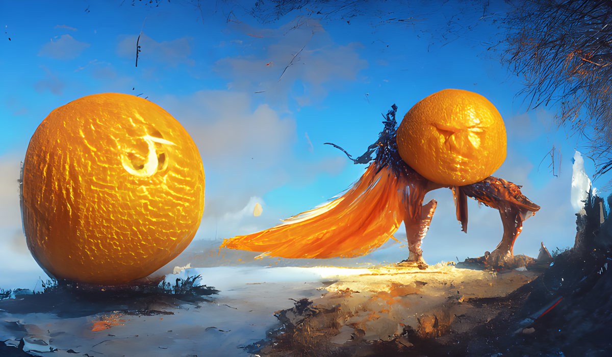
Contemporary artist Johan Grenier is a freelance illustrator and concept artist based in Annecy, France. He worked for Ubisoft for four years making concept art and 3D characters for Assassin’s Creed multiplayer. He currently does freelance work for Games Workshop, Privateer Press and Paizo Publishing. Like many of the other contemporary artists included here, he specializes in fantasy and video game-inspired artwork. He has a presence on both DeviantArt and ArtStation. Original art painted by the author using StarryAI The above image made me laugh out loud when I first saw it. If an orange can be described as haughty, this is it! With his smug face, his legs apparently made out of driftwood and his heroic stance, he sure looks like he thinks he’s something special. He even sports a superhero-style cape! You can definitely see the fantasy influences of Johan Grenier in this one. Grenier’s first initial has even been inscribed into the foreground orange as a tribute!
Lovecraftian
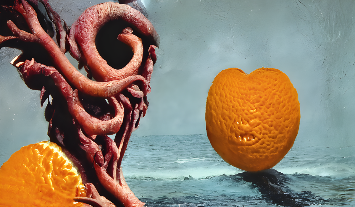
Surprisingly, H.P. Lovecraft (1890-1937), the man after whom this style was named, was not an artist! He was an American writer of science fiction and horror fantasy stories. Yet there is a very definite style of art associated with him, perhaps because of the style of book and magazine cover art used to illustrate his stories. Lovecraft also created the character of the Cthulhu, a hideous creature with octopus tentacles instead of a mouth and chin, and monsters like this have come to be associated with his name. Original art painted by the author using StarryAI Expect this style to put an octopus-like creature into your artwork. Here we see, along with an orange, a tentacled creature rising out of the ocean. The Lovecraftian style is a good choice when you want to imbue your images with an aura of fantasy and horror, especially if they involve tentacles!
Matte Painting
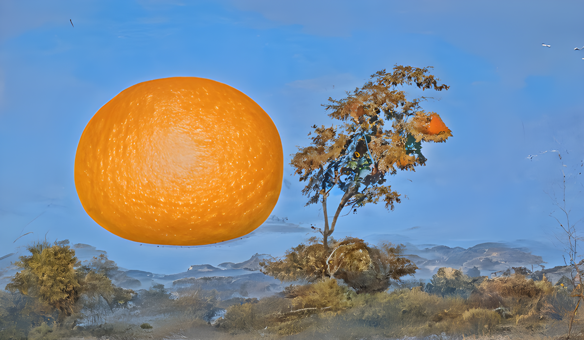
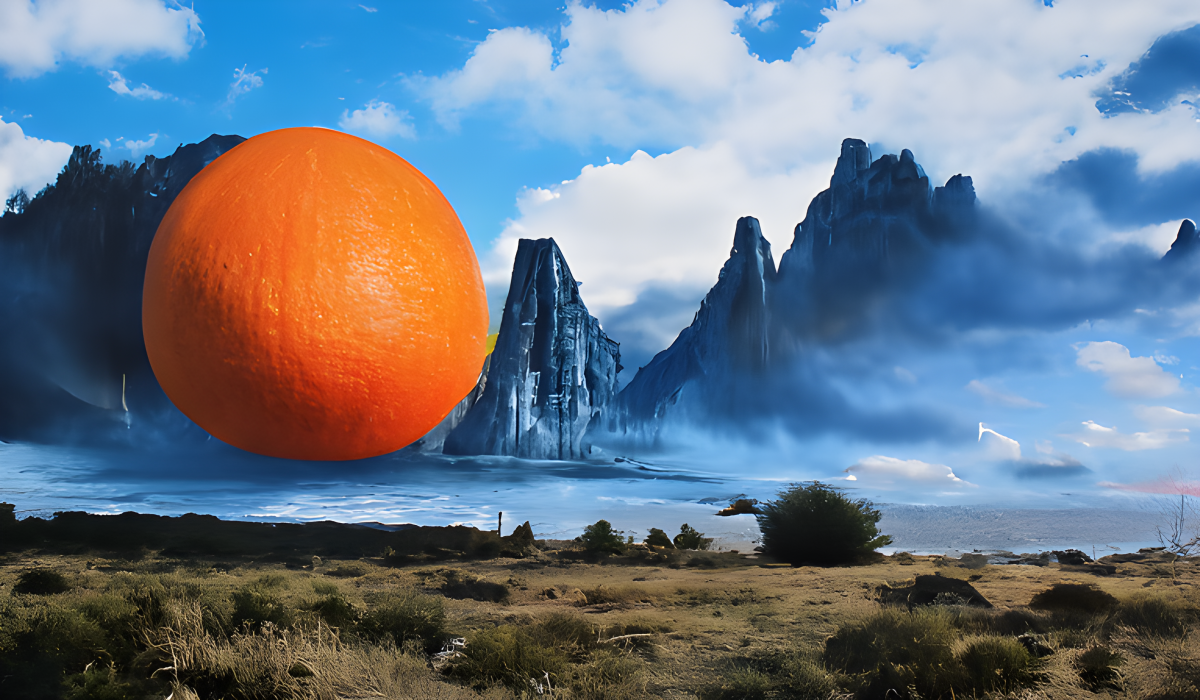
Matte painting is a movie special effects technique, especially common before the days of CGI. This is a technique moviemakers would use to, say, make space explorers look like they were on an alien planet. The background of the planet would be a large painting and the actors would be superimposed over it. Or, an aerial shot would show a colony of spaceman on Mars in which you could actually see the movement of the colonists on the alien planet. In this case, the movement of the colonists (actors) is simply superimposed over a portion of the painting. Original art painted by the author using StarryAI When you choose the matte painting style, you are instructing the AI to create something epic, especially in the case of a landscape. Above, we see the orange superimposed over a beautiful vista of mountains, lake, clouds and mist. The brush in the foreground looks almost photorealistic. In the full-sized version of this, you can see the individual blades of grass!
National Geographic Photo
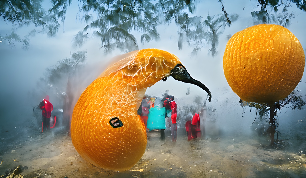
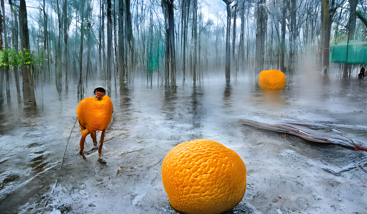
National Geographic as well known to most readers for their large, full color photos of people and animals in their native habitats. So when you choose the National Geographic style, you are likely to get a landscape that shows some kind of activity. Above, we see a rainy image of a forest with two oranges – or is it three? One of the oranges looks like a cross between an orange and a human—or perhaps he is wearing an orange costume? Despite the somewhat surrealistic imagery, I find this to be an aesthetic, well-balanced painting. Original art painted by the author using StarryAI At the top of this article, we see another image done in the National Geographic style. This one shows two oranges, and one of them looks like a kiwi bird! The other orange seems to be growing on a stalk. We also see some kind of hubbub of people in the background. Again, we have all the elements of the National Geographic style in this picture – a natural setting and the activity of people and/or animals.
The Rococo Style
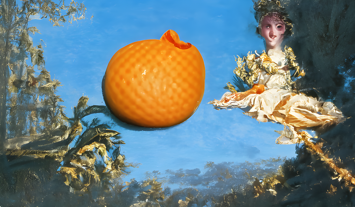
Funk and Wagnalls Desk Standard Dictionary of 1938 defined rococo as: “A degenerate style (17th to 18th centuries) of showy but meaningless decoration; hence anything fantastic or tasteless in art or literature.” Original art painted by the author using StarryAI I think history has been kinder to the rococo style in the intervening years. Rococo can be a beautiful style, especially as applied to architecture. We see elements of the rococo style in the asymmetrical foliage at left and in the style of the woman’s dress. But that woman! Why is she so homely? And why is her dress bunched up as if she’s sitting on the grass even though she’s floating in the air? Don’t ask too many questions of AI-generated art! We’ll just have to chalk these things up to surrealism! But seriously, the AI often gets faces wrong or distorted. My theory is that developers are afraid of the technology being used to create misleading images of real people, so the problem is “solved” by crippling its ability to create realistic faces. As this problem gets sorted out, faces should get better. The above image has some aesthetic qualities, but an image has to have some basis in reality in order to be considered truly appealing. I’m afraid this image is too far “out there” to fit into that category. Still, rococo is a style worth considering if you want to create an ornate or “period” look.
Seb McKinnon
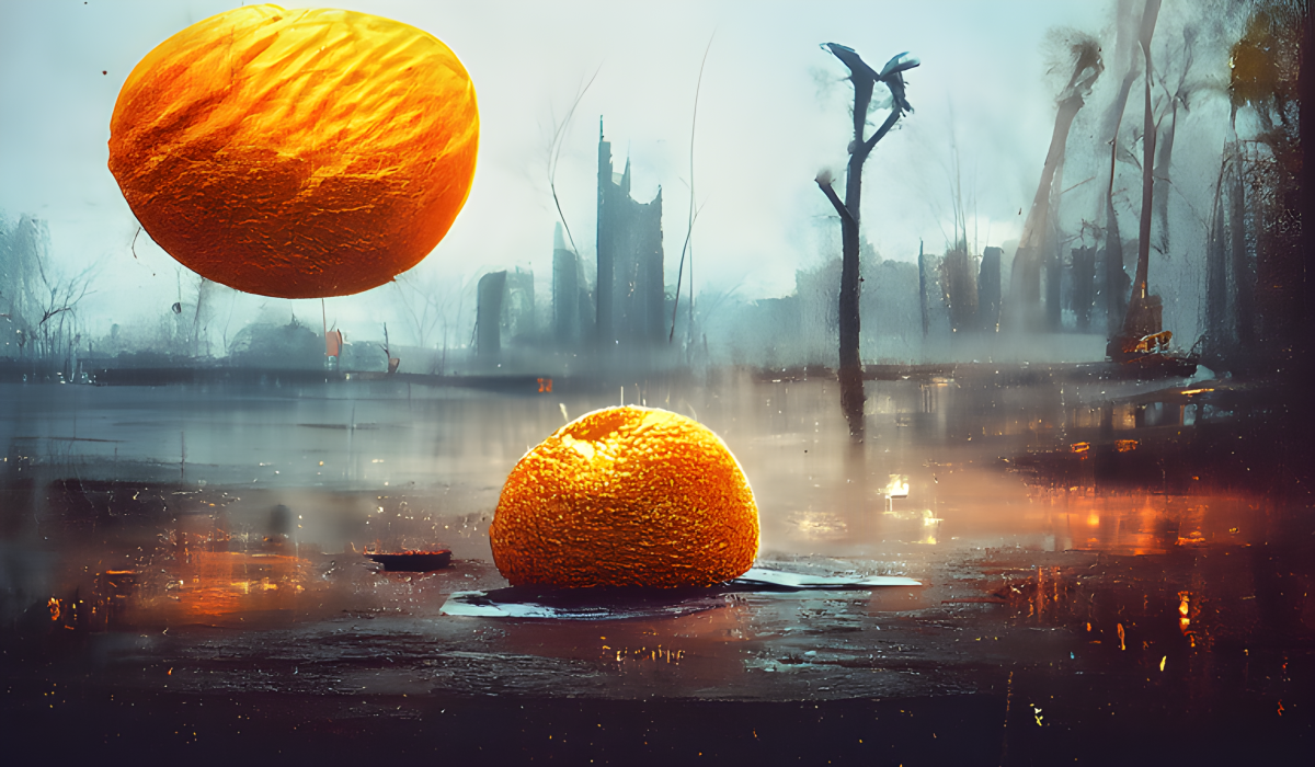
Seb McKinnon is a contemporary freelance illustrator living in Canada. He is best known for illustrating for the collectible card game Magic: The Gathering and has worked for the video game company Ubisoft as a game designer. McKinnon’s work falls into the category of surrealism with perhaps a little of the macabre thrown in. Much of it is indescribable, but think skeletons, ghoulish figures rising from the water, beautiful maidens riding giant crows, and creepy little girls in a pond surrounded by moths. Original art painted by the author using StarryAI We see a little of this with an apparent post-apocalyptic scene in the above image. Two oranges are apparently falling into murky water with what looks like urban ruins in the background. The Seb McKinnon style is a good style if you want to endow your images with a look of the surrealistic, the creepy and the macabre.
Thomas Kinkade
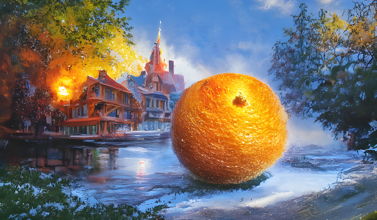
William Thomas Kinkade III (1958-2012) might have been thought of as a contemporary artist, but he died at the rather young age of 54. The American painter specialized in idyllic subjects such as picturesque Christmastime scenes and was particularly notable for the highly successful mass-marketing of his work in the form of reproductions, greeting cards, night lights, Christmas tree ornaments, figurines and much more. He was known as the “Painter of Light,” because most of his paintings featured the warm glow of a sunset, light issuing from the windows of a home at dusk, the radiance of a fireplace, etc. Original art painted by the author using StarryAI In the above image, you can see that the orange is superimposed over a wintry scene of picturesque homes with the warm glow of the sunset behind them. Choose the Thomas Kinkade style when you want to give your image a picturesque, quaint or homey look.
Tonalism
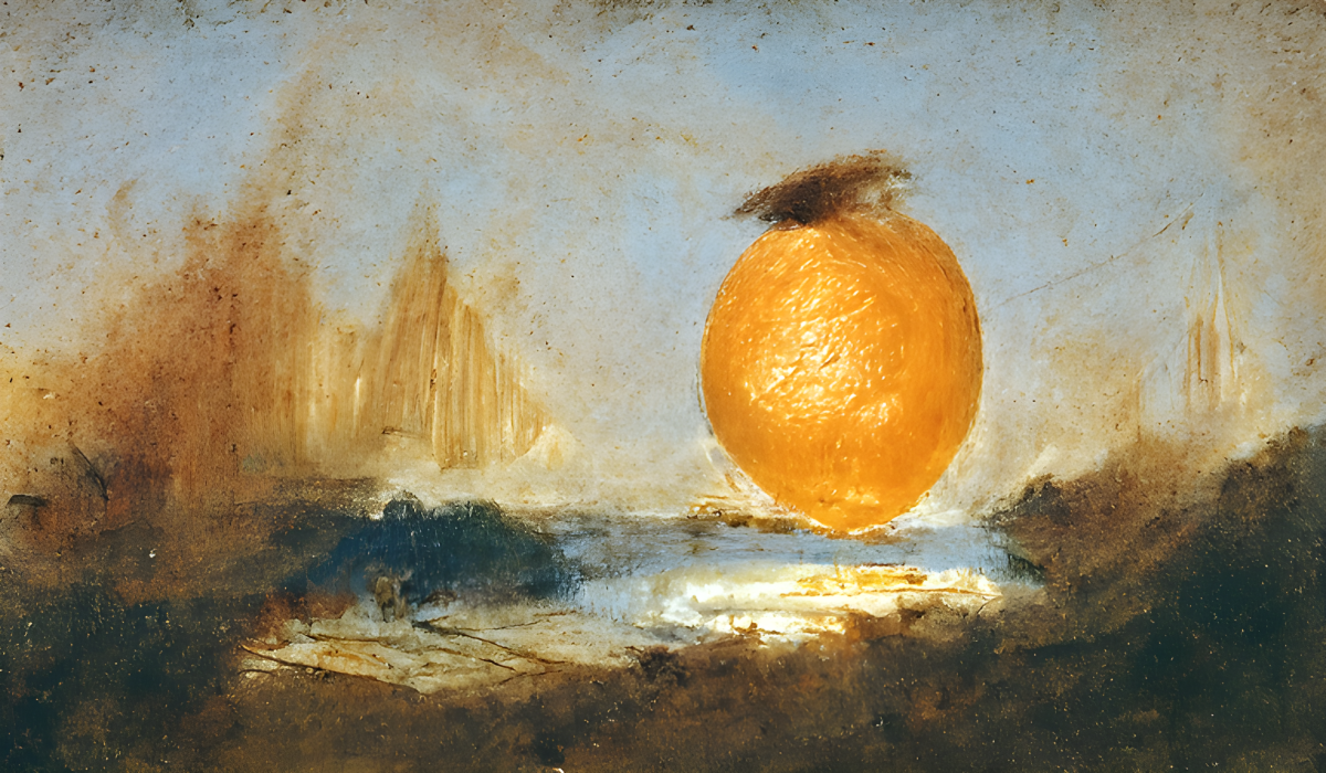
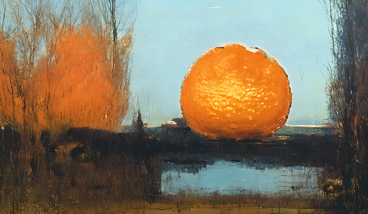
Tonalism was a French school of landscape art of the 19th century. The tonalists would paint a background of multiple thin layers of color on the canvas, one over the other, each one being dominated by a specific hue (or tone). Tonalists were influenced by the Barbizon landscape painters and by the impressionists. Americans later adopted their style, and found it useful for capturing the atmospheric effects they were familiar with, such as the summer haze and the glitter of snow. Original art painted by the author using StarryAI In the above image, what looks like thick paint appears to give the image an atmospheric effect. However, there is an ambiguity in this image. Is the orange resting on some kind of bridge, allowing one to see the water beneath it, or is the water actually a small pond or a puddle in the foreground? It’s impossible to tell for sure. Ambiguities like this are common in AI-generated art, but they are generally seen as undesirable by professional artists. Viewers like to know what they are looking at, and artists try to avoid juxtapositions of important elements that can cause unnecessary confusion. In any event, you can choose the style of Tonalism when you want to give your image an atmospheric or painterly effect.
Yanjun Cheng
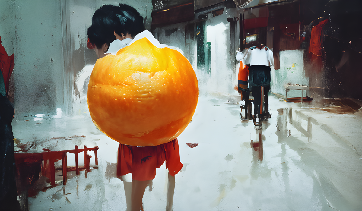
Yanjun Cheng is a contemporary portrait artist based out of New York City. Although most of her work involves portraits of comely young women, The look her style imparts to AI art is quite different! The Yanjun Cheng style, when chosen, often results in images of people milling about, often in urban settings. Most of the people have dark or black hair and their backs to the camera. The colors red and white often predominate. Original art painted by the author using StarryAI To my eyes, the look her style imparts to AI generated art is quite different from the actual art that Yanjun Cheng herself creates. It is not an unattractive style, but in my view it does not look much like the style of the artist after whom it is named. In the above image, we see an apparent woman in the foreground wearing a red skirt with her back to the camera – or is it two women? It’s hard to say. What looks like one or two people, perhaps riding bicycles, appear in the background. The orange is there, right over the foreground figure. This image introduces another ambiguity: is the orange floating in front of the foreground figure, or is she sporting an orange-shaped backpack? There’s no way to know for sure. In any event, the Yanjun Cheng style could be a good style if you want to produce an image showing figures in an urban setting. The above image is a nice painterly image with well-defined “brushstrokes.”
No Styles
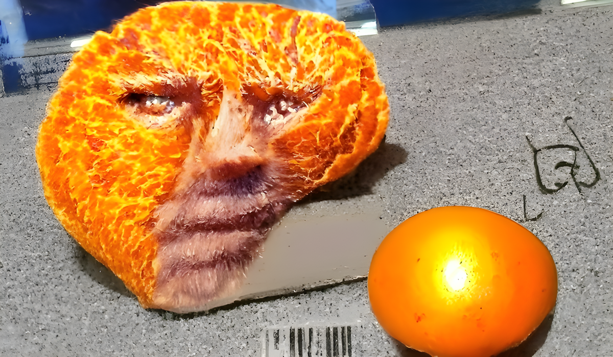
What happens if you create an image with no style chosen? Do you get a drab, styleless image? Or, does it look more like a photograph? I decided to try it. The above image was created with the very same prompt as all the others, “an orange,” but with no style applied. Original art painted by the author using StarryAI The result made me laugh out loud! There, in front of me, was a sliced-open orange with a very serious face staring back at me! Helping to balance out the artwork is a smaller orange-colored sphere. The unexpected incongruity of this image struck me as very funny and it became one of my favorite images of the bunch. It just goes to show, you never know what you’re going to get when you create AI artwork!
A few recipes
This content is accurate and true to the best of the author’s knowledge and is not meant to substitute for formal and individualized advice from a qualified professional.
